Previously in Part 1 and Part 2 I sought to answer the question of determining the qualities of an image by utilising statistical analysis. My main objective was to see if I could use the pixels to provide evidence to assert with a level of certainty that the image contains specific qualities. This can be necessary as photographs, especially landscapes, often have many qualities, and it can be hard to determine, for example, the most prominently occurring colours, what is most saturated, or whether the image is mostly cool or warm. In addition, I believed that the results could then be used in different applications such as image detection (which is outside the scope of this research) and generating novel colour palettes (to be explored in my design posts). For now, though, let us see what the data says.
For the visualisations, I will be using a mix of Power BI and R, but before I show and explain them, I need to preface how the image was read into the CSV in the first place.
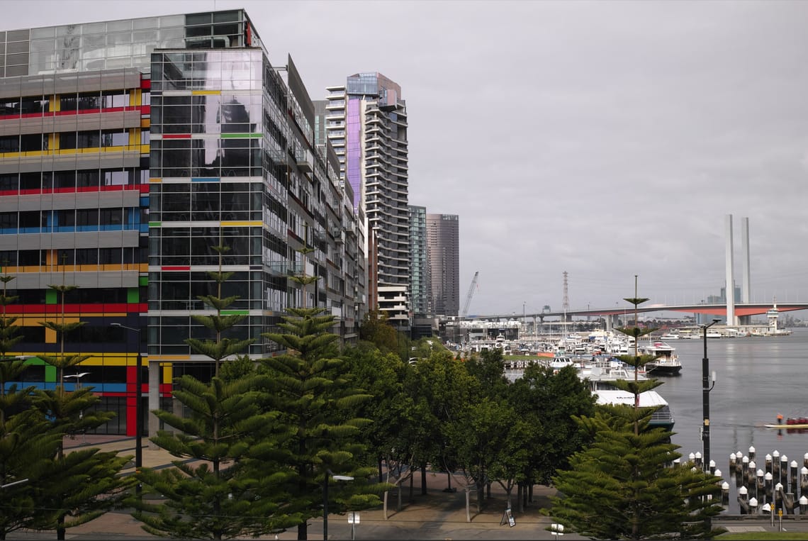
The image is read in from the top right corner and progresses along the X axis. At the end of the X axis, the Y axis will go down by 1 and read left to right again. Knowing this allows us to understand the visuals; for example, as the value of Y increases (going down the image), we might see more saturated red values than blue.
We should also note that a pixel's value is between 0 and 255, with 0 being black and 255 being white.
I would also like to note that this report is more informal in nature, this makes it easier for an exploratory analysis. With that out of the way we can begin!
The first set of graphs tells us a few simple things: our image's mean, standard deviation, and variance of the pixel values across the whole image. In addition to the standard red, green, and blue pixels, I have also included the pixel made up of all three values. This acts as an anchor point for comparison in terms of how strong a value is.
An enlarged version of the above is provided to make it easier to read.
If we were to speak about the image in terms of the whole pixel, a value of 113 indicates the overall image is slightly cool, given that the midpoint value is 127.5 (128 rounded up) for a middle grey. What is perhaps more interesting is that despite this, the overall saturation of red pixels is slightly brighter. So how then do we end up with a cooler image overall? Even though there is technically more red, it is still unable to pass the middle saturation point of 128, so the reds in the image overall are still quite mute.
Overall, we have determined the image's average coolness with a confidence of 99%. But what if we wanted to see how the colours gain and lose saturation in the image?
As we go from left to right, the overall image becomes much less saturated over time, and as we go from top to bottom, the average saturation increases. If we were to compare the image to the graph, we could determine at what point in the image an object has changed. Seeing these changes, we could take this down to a more granular level and detect changes and variations in each object; however, to what extent that may be useful will be a topic for further exploration.
Finally, this is a quick preview of the ten most frequently occurring pixel values and their overall proportion in the image. Despite the overall coolness of the image, we can see that the most commonly occurring values for red and green are very bright.
It is worth noting that if a selected pixel's channel is bright, it will only be vivid if the other channels are far less prominent. At first glance, you might attribute that red to, say, the building façade. However, if we drill down...
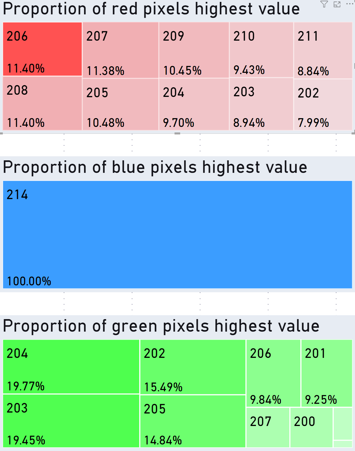
The associated values in the different colour channels are close enough to each other that the final RGB pixels that most frequently occur are a mix of slightly cool and warm greys.
Before we wrap up, here is one more simple graph made in R. It showcases the various colours and how their averages and standard deviations compare to each other. In comparison to the average RGB values, this confirms once again that most colours are sitting between the maximum and minimum saturation values.
In summary, this initial exploration showed that we can indeed make statistical inferences about the colours of an image relating to temperature, saturation, and relationships between pixel values.
I would like to close by saying this initial exploration has opened up more areas to explore and more images warranting testing. From a data perspective, I wonder if changes in values could improve edge detection and object detection in software that uses those functions. For design, I would be interested to see how we could use this to create novel colour-picking approaches.
If anyone would ever like to access the original image and database used, please contact me at info@maceam.com, as the originals take up too much space to host them.